How Are Cosmetic Swatches and Textures Photographed?
A cosmetic swatch shows what is inside the packaging: the colour of a lipstick, the consistency of a foundation or the shimmer in a powder. It helps someone understand the product before they can try it themselves.
I’ve photographed plenty of cosmetic swatches, and making them is often more involved than it looks. A simple swipe might take several attempts, particularly when it needs to match a whole range of shades.
The approach changes with the product. Lipsticks, foundations, powders and glosses all behave differently, so part of the process is finding a shape and technique that shows each one well.
What does a cosmetic swatch need to show?
For most swatch photography, colour is the first priority. The image needs to give a useful representation of the shade, alongside its texture and finish.
That could mean showing a creamy lipstick, a glossy liquid or the fine particles in a crushed powder. Lighting and styling need to bring out those qualities without making the product appear to be something it isn’t.
I usually photograph standalone swatches against white. It gives us a simple background for comparing colours and keeps attention on the product. A white background alone doesn’t guarantee accurate colour, though. Lighting, capture and the final colour checks still matter.
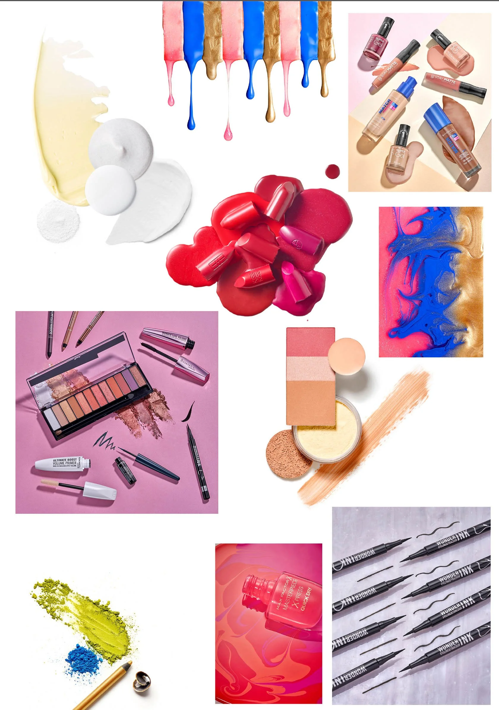
Swatches can also become part of a creative image. A smear beneath a lipstick, a pool of nail varnish or crushed eyeshadow around a palette can connect the packaging with the product inside.
Different products need different approaches
There isn’t one technique that works for every cosmetic formula. Some products hold a sculpted shape, while others spread or settle almost immediately.
Lipstick swatches
Lipsticks can be smudged, swiped or shaped with a palette knife. The amount of product and the pressure used affect the thickness, edges and marks left in the surface.
A thicker smear can show the creamy texture, while a thinner swipe reveals more of the way the product spreads. The choice depends on what the image needs to communicate.
Foundation and liquid makeup
With foundations and other liquid products, controlling the amount is important. A small change in quantity can alter the shape and thickness of the swatch.
Drops, pools and drawn-out smears each give a different result. More fluid formulas may continue moving after they have been placed, so the surface and timing become part of the process.
Powders and eyeshadows
Powders might be photographed crushed, scraped, loosely scattered or applied as a swipe.
Crushing can reveal the texture and create an interesting composition, but it needs some control. The size of the pieces and the spread of the finer powder affect how the finished image looks.
A craft knife can be useful for carefully removing product from a pan before arranging it.
What tools are used to make swatches?
Some of the most useful tools are quite straightforward. I use palette knives in different sizes for smudges and spreads, and cake-decorating scrapers can also work well for shaping products.
For liquids, syringes help control the quantity and placement. With powders, small cutting and scraping tools give more control over how the product is broken up.
The tool leaves its own mark, so its size and shape need to suit the swatch. A broad palette knife creates a different result from a narrow one, even when you are working with the same formula.
There is usually some testing involved. You can have a reference image and a clear idea of the shape you want, but you still need to see how the actual product behaves.
Why the surface matters
The surface you make the swatch on can make a surprising difference.
I find smooth surfaces such as tiles or Perspex useful because the tool can glide across them with less friction. That makes it easier to control a swipe or smear.
Paper and textured surfaces can catch the tool, absorb some products or interrupt the edges. They may suit a particular creative treatment, but they can make a clean, repeatable swatch more difficult.
It is worth testing the product on the intended surface before committing to the full set. Changing the surface can change the result as much as changing the tool.
Keeping a range of swatches consistent
Consistency is often the hardest part, especially when photographing a large selection of products.
The swatches need to feel related in their size, direction and overall shape. But different viscosities mean they won’t necessarily behave in the same way. One formula may hold a ridge beautifully while another spreads flat.
Sometimes an identical shape across every product simply isn’t realistic. The aim is to create a consistent visual approach while allowing the individual textures to show.
Agreeing a sample swatch at the start helps establish what we are working towards. We can then keep the framing, lighting and general proportions consistent across the range, making adjustments where a formula needs them.
Lighting colour, texture and finish
Lighting affects how much texture you see, as well as how glossy, matte or reflective a product appears.
A light positioned to reveal the ridges in a thick smear may need adjusting for a smooth liquid or a shimmering powder. Reflections can help describe the finish, but they also need controlling so they don’t obscure the colour.
This is why the styling and photography need to work together. A well-made swatch gives us something useful to light, and the lighting needs to show the qualities the stylist has brought out.
Colour should be assessed throughout the process. The thickness of a swatch and the surface beneath it can affect its appearance, and the final image will also vary between viewers’ screens. The aim is a faithful representation within those limits.
Standalone swatches or creative product photography?
The intended use helps determine the approach.
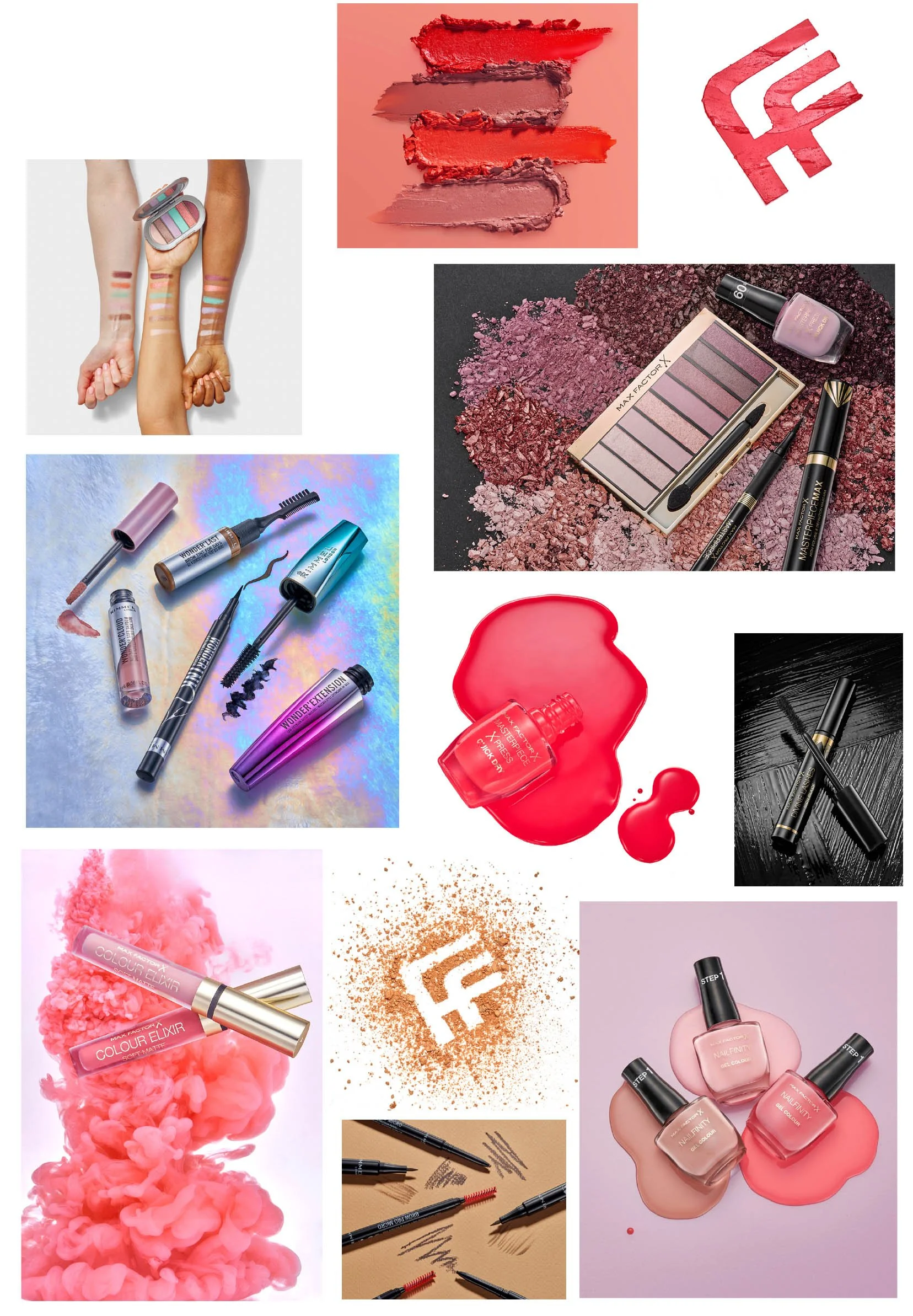
For an ecommerce shade range, a clear set of individual swatches makes comparison easier. A campaign image gives us more freedom to combine textures, packaging and colour in a single composition.
Both can be useful within the same image library. The standalone photographs explain the product, while the creative images give the brand more expressive content for advertising and social media.
My cosmetics portfolio includes examples of textures used alongside products, as well as more graphic compositions built around the makeup itself.
How should a brand prepare for a swatch shoot?
Supply enough product for testing and repeat attempts. Creating the final shape can use more than expected, especially with larger swatches or a formula that takes a few tries to get right.
Label every shade clearly and explain what matters most: colour comparison, texture, finish or a particular creative shape. A few references are helpful, along with details of where the images will appear.
My biggest recommendation is to work with an experienced stylist. A good stylist brings patience, control and a feel for how different products behave. That makes a real difference when we need a whole collection of swatches to work together.
If you are making them yourself, there is no substitute for practice. Test the tools, surfaces and quantities before the shoot, and allow time to remake a swatch when necessary.
Planning cosmetic swatch photography
Swatches can be a small part of a cosmetics shoot or the main focus of an entire image library. Either way, they deserve time and attention. The product needs to look appealing while still showing its actual colour and character.
If you are planning photography for makeup, skincare or a new shade range, you can explore my cosmetics photography services or get in touch to discuss the products and the images you need.